I never thought I'd feel like a rat trapped in a spinning wheel while choosing my superhero, but that's exactly how Marvel Rivals' character selection made me feel this season. As I launched into Season 3, the new smurf detection system struck first – my teammate vanished mid-match after a mysterious warning popped up, leaving us scrambling like ants whose hill got kicked. Little did we know NetEase had deployed invisible sentinels across the arena, sniffing out alt-accounts with the precision of bloodhounds tracking scent trails through a thunderstorm. Those caught smurfing faced nuclear consequences: season-long competitive bans and rank resets looming like execution dates. The tension in voice chat became thicker than Asgardian porridge as players nervously wondered who'd disappear next.
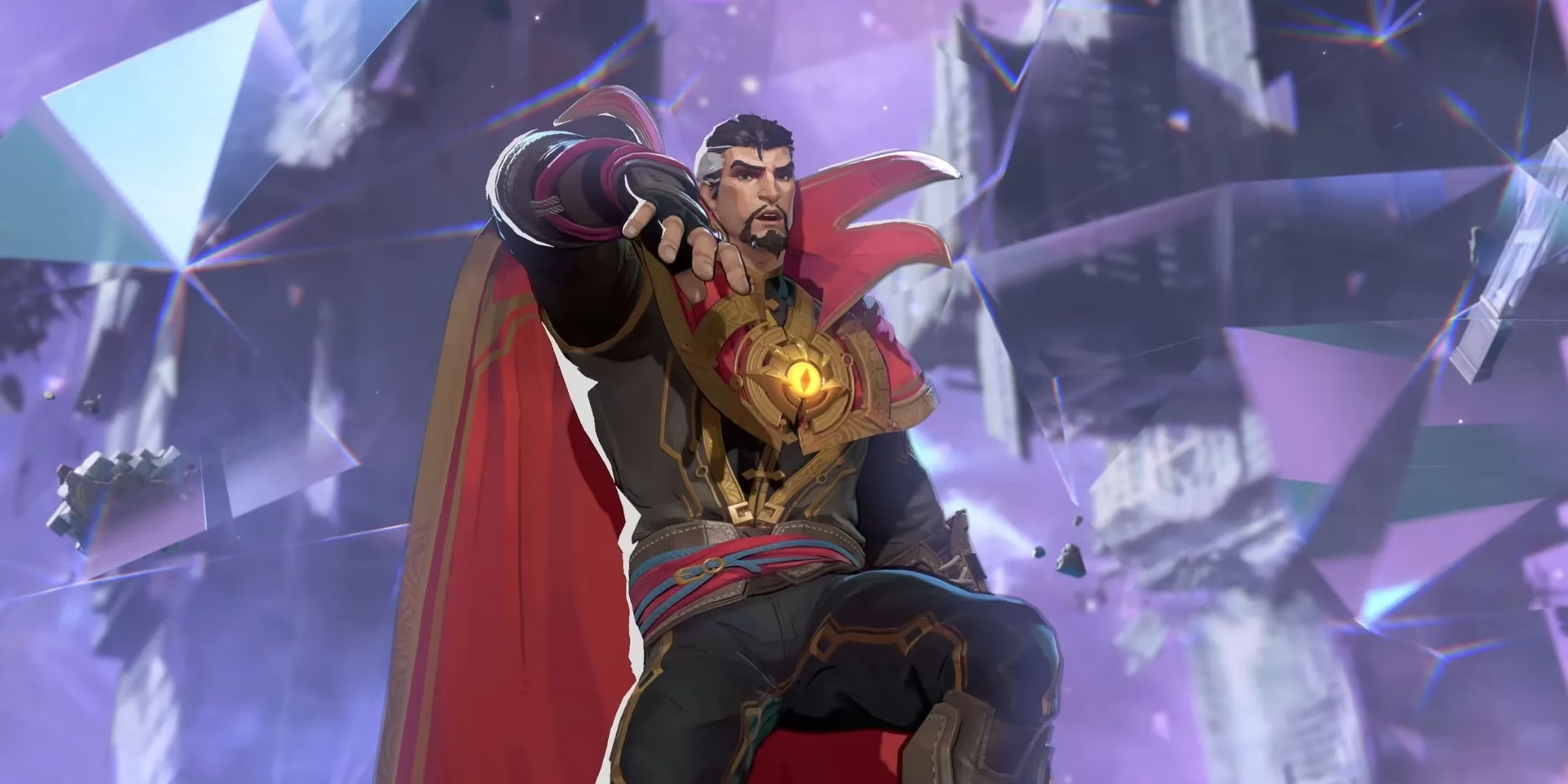
What truly broke the camel's back though? That godforsaken hero wheel. Scrolling through it felt like trying to read a dictionary spinning on a carnival carousel – just as I'd spot Iron Man, Hela would whirl past, leaving me fumbling like a novice magician dropping his wand. When Reddit user imjokeslol suggested displaying all heroes simultaneously instead of this rotary torture device, our entire Discord erupted in unanimous \u201cYES!\u201d emojis. One brilliant counterproposal emerged: letting us favorite characters so our mains appear upfront, like VIPs at a club velvet rope. With Blade slicing his way into the roster next month during Season 3.5, this UI flaw threatens to become as chaotic as a New York subway during alien invasions.
People Also Ask:
-
\u2753 Why do developers implement smurf detection systems?
-
\u2753 How does favoriting mechanics improve gameplay flow?
-
\u2753 What makes Blade's upcoming addition strategically significant?
Amidst these frustrations came one glorious quality-of-life improvement: the post-match progress tracker. Suddenly, seeing my Accessory Points tally and challenge completions felt like finding an oasis after trekking through menu deserts. No more digging through nested screens like an archeologist brushing sand off relics – everything now appears instantly after matches, crisp as a freshly printed Daily Bugle headline. This tiny change sliced between-match downtime sharper than Wolverine's claws, proving NetEase can nail UX when they focus.
The community's current state mirrors Schrodinger's superhero – simultaneously frustrated by the wheel yet hopeful about fixes. We're buzzing about Blade's arrival like kids awaiting Christmas, but that selection screen remains our collective thorn. As I log off tonight, I wonder: will Season 3.5 bring the grid-style hero display we crave, or are we doomed to keep spinning that wheel until our fingers blister? Only time will tell if NetEase listens before players vanish faster than villains snapped by Thanos.