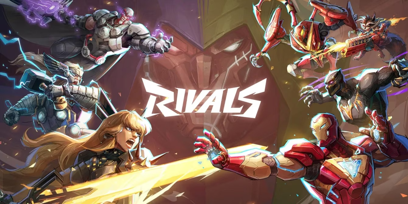
In the cutthroat arena of live-service games, Marvel Rivals has somehow managed to charm its way to the top, becoming a free-to-play darling that players just can't quit—much like that one friend who always shows up at parties uninvited but brings the best snacks. 🤷♂️ Sure, it's got the Marvel magic to thank, but as anyone who endured the tumbleweed days of Marvel's Avengers can attest, brand love alone doesn't cut it. No, this game has a secret sauce, maybe a dash of addictive gameplay or the thrill of superhero smackdowns that keeps folks coming back for more... even when they're cursing at their screens over its quirks. And oh boy, the quirks! While NetEase has smoothed out some wrinkles over the years—like those pesky performance hiccups and roster imbalances that once made matches feel like a coin toss—there's one stubborn gremlin that refuses to play nice: the character select screen. It's like the game's grumpy grandpa, set in its ways and determined to make life harder for everyone. Honestly, who thought this semi-wheel design was a good idea? It's not just unpopular; it's practically a meme among the community, and as we cruise into 2025, it's high time we unpack why this UI nightmare is here to stay, despite the collective groans.
The Great UI Debacle: Where Things Go Sideways
Now, let's dive into the nitty-gritty. Character select screens are supposed to be the calm before the storm, a zen garden where players gear up for battle without breaking a sweat. But in Marvel Rivals, it's more like navigating a funhouse mirror maze after too much caffeine. The semi-wheel layout—a quarter-circle that masquerades as innovative—is a real pain in the neck. Picture this: you're scrolling through heroes with your gamepad, and suddenly, 'up' feels like 'diagonally left,' especially at the curve's sharpest point. It's as if the UI has a mind of its own, whispering, "Oops, did you mean that other character?" 😅 This awkwardness isn't just annoying; it's downright confusing, turning what should be a five-second tap into a mini-adventure. And with the roster ballooning faster than a Hulk smash, finding your favorite hero means endless scrolling through sections—talk about unnecessary roadblocks! NetEase clearly went rogue here, shunning the grid-style simplicity of games like Overwatch or Mortal Kombat, and for what? No one's singing praises about this 'creative choice'—it's just a clunky relic that players have griped about since the beta days.
Why Players Keep Asking: The Unanswered Queries
Despite its flaws, fans soldier on, leading to some burning questions that pop up in forums like clockwork. You know, those 'People Also Ask' moments where everyone's scratching their heads:
-
Why hasn't NetEase fixed the character select screen yet? Well, darling, it seems they're doubling down on their vision, even if it feels like driving a square wheel.
-
Is the UI really that bad, or are we just whining? Oh, it's bad—like trying to text with mittens on bad. But hey, at least the game's success hasn't tanked... yet.
-
Could a redesign actually happen someday? Don't hold your breath; NetEase seems content to let this sleeping dog lie.
These aren't just minor nitpicks; they're the chorus of a community that's grown used to the quirks but still dreams of smoother sailing. After all, in a world where games evolve faster than a speedster hero, this UI stands out like a sore thumb—or should we say, a stubborn wheel?
The Personal Crystal Ball: A Glimpse into 2026
Here's where I toss in my two cents, folks. In my not-so-humble opinion, by 2026, the tides might finally turn. Picture it: NetEase, pressured by player uproar and dwindling patience, rolls out a sleek, grid-based makeover that makes character selection feel like a breeze. 🎉 Suddenly, matches start faster, frustrations melt away, and the game ascends to true legend status... but we'll see. Until then, it's a waiting game, and that semi-wheel will keep spinning its tales of woe. Honestly, it's like that friend who insists on using a flip phone in a smartphone world—charming in a nostalgic way, but seriously, get with the program!
Wrapping It Up: The Game That Endures
So, what's the takeaway? Marvel Rivals remains a powerhouse, flaws and all. Its character select screen might be a dumpster fire 🔥 of design, but it's become part of the charm—a testament to how players adapt and endure. As NetEase steers this ship into the future, let's hope they remember that even the mightiest heroes need a polish now and then. For now, we'll keep spinning that wheel... and maybe, just maybe, laugh about it later.