As a Duelist main who’s sunk more hours into Marvel Rivals than I care to admit, I have to be honest — ever since Johnny Storm blazed into the roster back in Season 1, my matches have been pure chaos. And I don’t mean the fun kind of chaos where you’re popping off with combos. I mean the kind where I literally can’t tell if that wall of fire in front of me belongs to my teammate or our opponent.
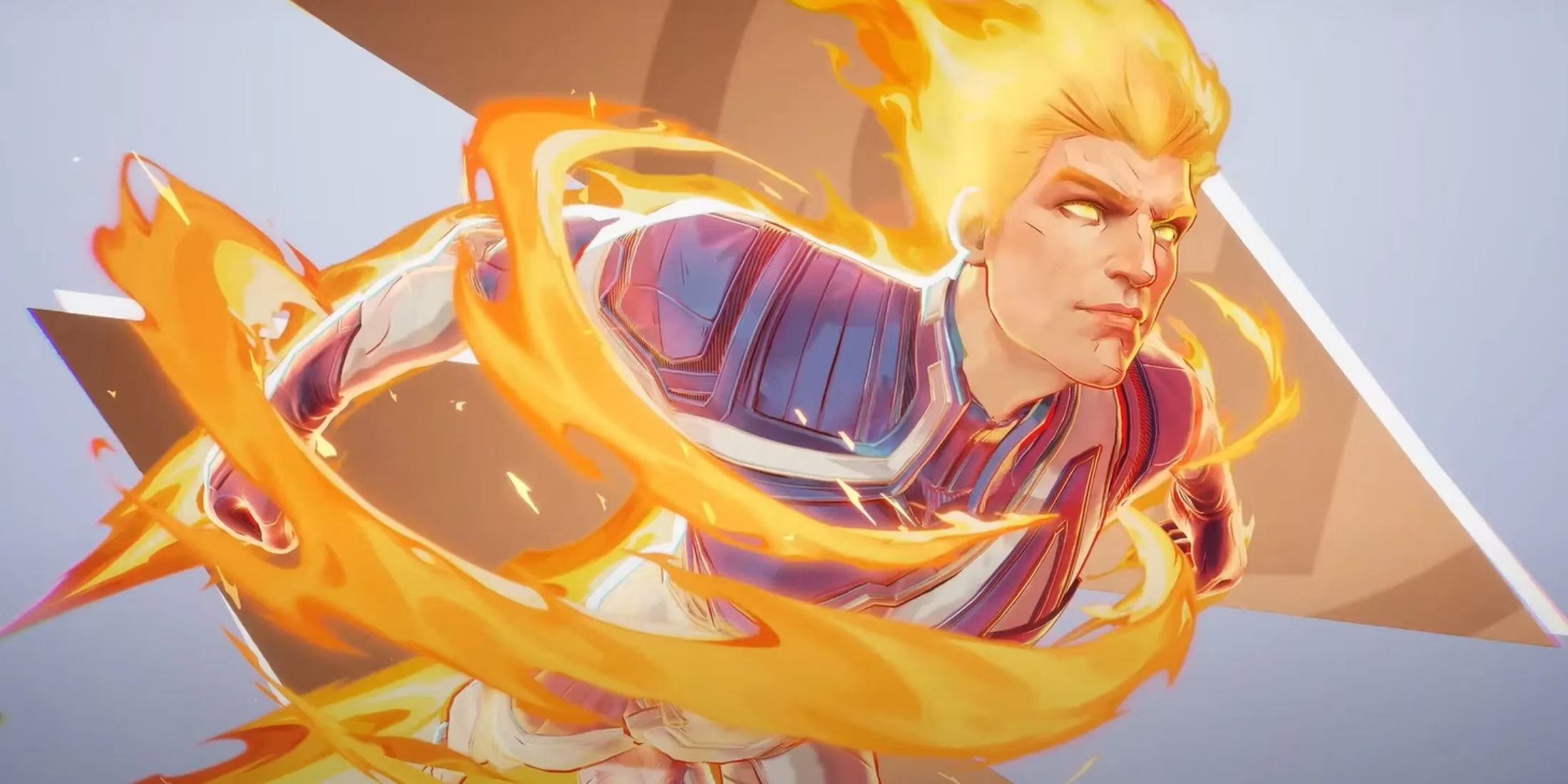
It’s been well over a year now since the Human Torch first appeared, and honestly, it feels like we’re still dealing with the same readability problem. The flames from an allied Human Torch and an enemy one look way too similar. Sure, some players have pointed out that the enemy’s fire is slightly redder while your teammate’s is that classic yellow-orange. But in the middle of a fight — with Ultimates popping, Invisible Woman force fields shimmering, and a Hulk smashing through a wall — there’s just no way my brain can process that subtle a difference.
I’m not the only one frustrated. Back when the hero was brand new, Reddit threads were already lighting up with complaints. One user, RandomChaosGenerator, basically begged the devs to make the visual distinction clearer. The whole thread blew up because so many of us were walking into enemy firewalls thinking it was safe territory. It’s not a skill issue — it’s a readability failure.
What makes it worse is how powerful the Human Torch’s kit actually is. His Pyro-Prison ability? That thing shreds. You place active Flame Fields and connect them with a scorching wall that constantly damages enemies caught inside. When an enemy Torch drops one of those, and you mistakenly think it’s from your own guy, you’re basically cooked. Combine that with his high mobility and the synergy he gets with Storm — a duo that can fly around the map raining fire and lightning — and the confusion goes from annoying to match-losing.
Now, let me give credit where it’s due. The devs have done some work on visual clarity across the board. The Thing, who dropped alongside Johnny, is a Vanguard with a simple, chunky style that’s super easy to read. You never mistake a friendly rock monster for an evil one because the whole silhouette and color palette just pop. Mister Fantastic’s stretchy moves and Invisible Woman’s force bubbles are also distinct. But the Human Torch? He’s still that one hero where I have to do a double — sometimes triple — take.
And before you ask, yes, the community has floated a ton of solutions. Make the friendly flames blue or add a faint outline. Give enemy fire a VFX tweak like a subtle red glow or embers that swirl differently. Add a UI indicator when you’re near a teammate’s ability versus an opponent’s. Pretty much anything would be better than what we have now. Even adding an option for colorblind players could drastically improve things — after all, telling a slight red shift from yellow-orange is even more impossible for some friends I play with.
“Wait, that’s OUR fire?”
— Me, every single match in 2026
The crazy part is that this isn’t just a casual complaint. In higher ranks, where positioning and ability denial matter so much, confusing an ally Human Torch’s zone control for an enemy’s can decide a match. I’ve literally watched teams bait themselves into a Pyro-Prison because they thought it was friendly and got team-wiped. That level of misplay shouldn’t be on the players — it should be on the UI and VFX teams.
I’ll still play Johnny Storm because his movement is sick and the combo potential with other duelists is terrifyingly good. But every time I see two Human Torches on the map, I’m just bracing myself for a guessing game. Until NetEase throws us a visual overhaul for his flames, I’ll keep yelling at my monitor during clutch moments.
So, dear developers, if you’re reading this — please, light up our games with a little more clarity. Until then, I guess I’ll just keep running away from anything that glows orange, friendly or not.